lesson 3.7.5 highlighting with rules
Automatically Formatting Cells Based on Their Value

Ever looked at a huge spreadsheet full of numbers and felt a bit lost? What if your spreadsheet could give you superpowers, allowing you to spot the most important information in a flash? Today, you're going to become a Data Analyst and learn a secret trick called Conditional Formatting. It’s like teaching your spreadsheet to use a set of highlighters, automatically colouring in the data you care about. This skill is vital for professionals in finance, science, and business who need to turn boring data into powerful stories.
Learning Outcomes
The Building Blocks (Factual Knowledge)
The Connections and Theories (Conceptual Knowledge)
The Skills and Methods (Procedural Outcomes)
Recall that conditional formatting applies formatting to cells based on specific rules.
Describe the purpose of different conditional formatting types, such as colour scales and data bars.
The Connections and Theories (Conceptual Knowledge)
Analyse how a spreadsheet model can be used to answer "what-if" questions.
Evaluate which type of chart or formatting is best for visualising different kinds of data.
The Skills and Methods (Procedural Outcomes)
Apply conditional formatting to cells based on specific rules to highlight key information.
Use a wider range of mathematical and statistical functions (e.g., MIN, MAX, COUNT).
Digital Skill Focus: Using spreadsheet software to organise, calculate, analyse, model, and visualise numerical data.
From Numbers to Knowledge
So far, you've built a fantastic modelAn abstraction of an entity in the real world or in the problem that enables an automated solution. The abstraction is a representation of the problem that leaves out unnecessary detail. of a school tuck shop. It's full of data, formulas and functions that calculate your overall profit. But right now, it's just a wall of numbers. To get real knowledge from this information, we need to make the important parts stand out using special spreadsheet tools.
Imagine you're the manager of the tuck shop. You're very busy, and you need to see two things instantly:
Which items are we running out of?
Which items are making us the most profit?
Reading every single number is slow and inefficient. This is where conditional formatting comes in. It's a spreadsheet feature that automatically changes the appearance of a cell - like its background colour or font colour - based on a rule you create. It turns your spreadsheet into a dynamic dashboard!

Task 1 Rule Breakers
The Rules
Scores greater than or equal to 80 should be Green.
Scores between 50 and 79 should be Amber.
Scores less than 50 should be Red.
Look at the table below and identify the two students whose scores have been formatted with the wrong colour. Make a note of the names and the colour their score should be.

Something is wrong...
Outcome: I can read and apply a set of conditional formatting rules to check if data has been formatted correctly.

Teaching the Spreadsheet to Think
There are many types of conditional formatting, but they all follow the same logic: IF a cell's value meets a condition, THEN apply a specific format. Let's look at the most common types.
Highlight Cells Rules: This is the most common type. You can set rules like "Cell Value is Greater Than...", "Less Than...", "Equal To...", or "Text that Contains...". This is perfect for highlighting low stock or high scores.
Data Bars: This format fills the cell with a coloured bar, where the length of the bar represents the cell's value relative to other cells. It's like having a mini bar chart inside every cell, great for comparing sales figures.
Colour Scales: These apply a colour gradient to a range of cells. For example, you can set it so the lowest values are red, mid-range values are yellow, and the highest values are green. This gives you a "heatmap" of your data, perfect for seeing trends at a glance.

Task 2 The Data Dashboard
1
Get organised
Download this enhanced version of your Tuck Shop spreadsheet which includes stock levels.
Remember to click the Enable Editing button on the yellow warning bar in Microsoft Excel.
2
Get colouring!
Open your spreadsheet and apply the following four rules.
1
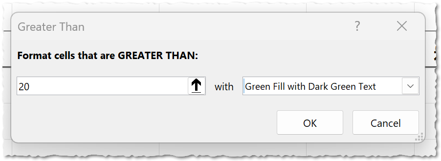
Highlight High Profit
Select just the cells with the data in your
ProfitGo to Conditional Formatting -> Highlight Cells Rules -> Greater Than....
We want to see items with more than £20 profit. Enter
20Format the cells with Green Fill with Dark Green Text.

Greater than...
2
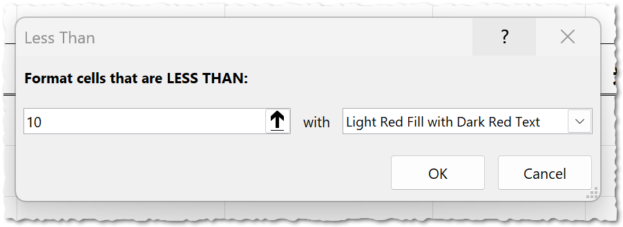
Warn of Low Stock
Select just the cells with data in your
Closing StockGo to Conditional Formatting -> Highlight Cells Rules -> Less Than....
Our danger level for stock is 10. Enter
10Format the cells with Light Red Fill with Dark Red Text.

Less than...
3
Create a Sales Heatmap
Select just the cells with data in your
Quantity SoldGo to Conditional Formatting -> Colour Scales.
Choose the Green - Yellow - Red colour scale.
The spreadsheet will automatically colour the highest sales green and the lowest sales red.
4
Visualise Revenue
Select just the cells with data in your
Total RevenueGo to Conditional Formatting -> Data Bars.
Choose any style of 'Gradient Fill' data bar.
3
Check to see whether you are correct!
When you have finished, your spreadsheet should look like this...

The completed masterpiece
4
Let's make some changes
It's important that you see that the conditional formatting rules are dynamic - in other words, the formatting of the cells may alter if the data alters.
1
We overestimated the number of chocolates we sold. Change the value in cell E3 to
302
We miscounted the starting stock of drinks. There were actually only 55 in stock at the start of the period. Change the value in cell B4 to
553
We underestimated the number of apples we sold. Change the value in cell E5 to
38Outcome: I have used four different types of conditional formatting to turn my spreadsheet model into a dynamic and easy-to-read data dashboard.

Out of Lesson Learning
Last modified: October 16th, 2025


