


lesson 2.2 - accessibility needs: motor, speech & cognitive
Master accessible design for motor, speech, and cognitive needs so your digital points don't leave users in the doghouse.
Last lesson, we looked at helping users who have visual or hearing challenges. But what if a user can't use a mouse accurately, or can't use voice commands, or finds complicated websites confusing?
Today, we're going to explore how we can design apps and websites that are easy to use for people with motor, speech, and cognitive needs. Let's make sure our tech doesn't leave anyone behind!
Learning Outcomes
The Building Blocks (Factual Knowledge)
The Connections and Theories (Conceptual Knowledge)
The Skills and Methods (Procedural Knowledge)
Recall the three categories of accessibility needs: motor , speech , and cognitive.
Describe the common challenges faced by users with these specific needs.
The Connections and Theories (Conceptual Knowledge)
Explain how specific UI design choices (like button size or layout consistency) can either include or exclude users with motor, speech, or cognitive impairments.
The Skills and Methods (Procedural Knowledge)
Analyse a user interface and identify features that support (or hinder) users with these accessibility needs.
Apply accessibility principles to suggest improvements for a given user interface.
Digital Skill Focus: C.3.1.1 Word Processing: This lesson focuses on using a word processor to create a structured and professional document, applying character and paragraph formatting (like headings and lists) and inserting objects (like images or shapes) to communicate information clearly.
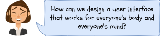
What are Motor, Speech, and Cognitive Needs?
Good design is inclusive design. It means making products that everyone can use, regardless of how their body or brain works. This isn't just a "nice to have" feature; it's essential for a successful product. Let's break down three key areas.
1
Motor Needs
A motor accessibility need relates to a user's physical ability to interact with a device. Someone might have tremors, muscle weakness, or limited mobility, making it difficult to perform precise actions like:
Controlling a mouse pointer accurately.
Clicking on small buttons or links.
Typing on a small keyboard (like on a phone).
Performing "click and drag" actions.
UI Solutions
Large Click Targets: Making buttons, links, and form fields big enough to be easily clicked or tapped.
Keyboard Navigation: Ensuring a user can get to every single interactive element on a page just by using the 'Tab' and 'Enter' keys.
Voice Control: Allowing users to navigate and input text using spoken commands (this is also a speech feature).
"Sticky Keys": An operating system feature that lets a user press key combinations (like Ctrl + P) one at a time instead of having to hold them down together.
2
Speech Needs
A speech accessibility need relates to users who cannot speak clearly, or at all. In the past, this wasn't a huge issue for UI design. But with the rise of voice assistants (like Siri, Alexa) and voice-only interfaces, it's a major barrier.
If your app only relies on voice commands, these users are completely locked out.
UI Solutions
Text-Based Alternatives: Always provide a way to type a command as an alternative to speaking it.
On-Screen Keyboards: A visual keyboard on the screen that can be controlled with a mouse, stylus, or even eye-tracking.
Haptic Feedback: Using vibrations (like on a phone) to confirm an action has been completed, so the user doesn't need to rely on voice confirmation.
3
Cognitive Needs
A cognitive accessibility need is a very broad category covering how people process information. Users might have:
A learning disability (like dyslexia).
Memory issues (like dementia or short-term memory loss).
Difficulty focusing (like ADHD).
Complex layouts, confusing jargon, distracting animations, and hidden menus can be major barriers for these users.
UI Solutions
Simple, Clear Language: Avoid jargon. Use short sentences and plain English.
Consistent Layout: Keep navigation and buttons in the same place on every page. This builds familiarity and reduces cognitive load.
Icon Support: Use simple, universally understood icons next to text labels (e.g., a house icon for 'Home', a cog icon for 'Settings').
Progress Indicators: Show users where they are in a process (e.g., "Step 2 of 4 in your booking").
Avoid Distractions: Don't use flashing ads, auto-playing videos, or complex, unnecessary animations.

Task Accessibility Agents: Design-a-Poster!
Your teacher will assign your pair one of three accessibility needs:
Motor
Speech
Cognitive
1
Part 1: Plan (5-10 mins)
With your partner, get your poster materials.
First, sketch a quick plan on scrap paper. Decide on your title and how you will lay out the different sections.
2
Part 2: Create (20-25 mins)
Create your final poster. It needs to be bold, colourful, and easy to read from a distance.
Your poster must include:
A clear main title (e.g., "A Guide to Cognitive Accessibility").
A short, simple definition of the accessibility need.
A "Good Design 👍" section: Draw or describe 3 helpful UI features. For each one, write a short sentence explaining why it helps.
A "Bad Design 👎" section: Draw or describe 3 frustrating UI features. For each one, write a short sentence explaining why it's a barrier.
Outcome: I have created a physical poster with my partner that explains our assigned accessibility need (Motor, Speech, or Cognitive) and shows three examples of good UI design and three examples of bad UI design for it.


Hungry for more?
Use a mindmapping software like MindMup to make a revision mindmap of this lesson.
Make some physical flashcards.
Application to the Component Sample PSA
The Majestic Cinema brief (Component 1) states the audience is a 'diverse local community' and includes 'customers with accessibility needs (e.g., wheelchair users, patrons with visual or hearing impairments)'. Today's lesson is directly applicable:
Motor Needs: A wheelchair user might also have motor impairments affecting their hand movement. The 'Book Now' button and film selection options on the 'What's On' screen must be large and easy to click. The entire booking process (C1.B3.1) must be navigable using only the 'Tab' and 'Enter' keys on a keyboard.
Speech Needs: If the cinema website had a "voice search" for films, it must also have a standard text-based search bar (using the 'Magnifying Glass' icon ) as an alternative.
Cognitive Needs: The audience includes 'families with young children' and a 'diverse local community'. The 'What's On' page must use simple, clear icons (like the film ratings U, PG, 12A) and simple language to describe the films, not complex jargon. The booking process should be broken down into simple, numbered steps to help users with memory or focus.
Out of Lesson Learning
⭐ Quick Sketch
The Majestic Cinema brief needs a "Facilities & Accessibility" screen. On paper, sketch a simple layout for this screen that specifically helps a user with a cognitive need. Label one feature you have included and explain why it helps (e.g., "Simple icon of a wheelchair for 'Wheelchair Access' is faster to understand than text ").
The Majestic Cinema brief needs a "Facilities & Accessibility" screen. On paper, sketch a simple layout for this screen that specifically helps a user with a cognitive need. Label one feature you have included and explain why it helps (e.g., "Simple icon of a wheelchair for 'Wheelchair Access' is faster to understand than text ").
⭐⭐ The "Tab" Test
Ask a parent or guardian to load a real cinema website (e.g., Odeon, Cineworld, Vue) on a computer at home. Try to navigate to the ticket booking page using only the 'Tab' key and 'Enter' key on the keyboard. Write a short paragraph explaining your findings. This tests how well the site works for users with motor needs.
Ask a parent or guardian to load a real cinema website (e.g., Odeon, Cineworld, Vue) on a computer at home. Try to navigate to the ticket booking page using only the 'Tab' key and 'Enter' key on the keyboard. Write a short paragraph explaining your findings. This tests how well the site works for users with motor needs.
⭐⭐⭐ Competitor Analysis
Ask a parent or guardian to help you find two different cinema websites. Create a small table on paper comparing them on three accessibility features for motor or cognitive needs. Which one is better?
Ask a parent or guardian to help you find two different cinema websites. Create a small table on paper comparing them on three accessibility features for motor or cognitive needs. Which one is better?
Are the "Book Now" buttons large?
Is the language simple?
Is the layout consistent?
Write a one-sentence recommendation for the Majestic Cinema based on what you found. (e.g., "The Majestic Cinema should use large, clear buttons like 'Website A' but use simple icons like 'Website B'").
Last modified: December 18th, 2025

")
")
")
")
")
")
")
")
")
")


