


lesson 2.3 - user skill levels (novice to expert)
From absolute beginners to tech wizards—learn how to design interfaces that don't make novices cry or experts yawn!
Have you ever tried to use a new app and felt totally lost? Or ever felt frustrated because a website was too slow and treated you like a complete beginner?
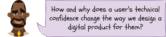
Today, we're looking at why that happens. We're exploring how a user's skill level - from a total 'novice' to a super-confident 'expert' - completely changes what they need from a digital product.
Learning Outcomes
The Building Blocks (Factual Knowledge)
The Connections and Theories (Conceptual Knowledge)
The Skills and Methods (Procedural Knowledge)
Recall the four main user skill levels: novice, occasional, regular, and expert.
The Connections and Theories (Conceptual Knowledge)
Describe how the design of a user interface (UI) should be adapted to meet the specific needs of each different skill level .
Analyse the fundamental trade-off between an interface that prioritises guidance (for novices) and one that prioritises efficiency (for experts).
The Skills and Methods (Procedural Knowledge)
Apply knowledge of user needs to analyse a given scenario.
Create simple user personas that represent different user skill levels for a digital product.
Digital Skill Focus: C.3.6 User-Centred Design : Specifically, the declarative knowledge that "a persona is a fictional character created to represent a key user type" and the procedural skill to "create a simple persona for a target user... including their goals, skills, and frustrations".
Who Are You Designing For?
Part of effective User Interface (UI) design is knowing your audience. A massive part of that is their skill level. You can't design the same interface for a first-time user and a professional who uses that same product 8 hours a day.
Understanding your users' confidence and experience is essential for creating a successful product. We can break this down into four main groups.
The Four User Skill Levels
1
The Novice User
Who they are: The total beginner. They have no prior experience with your interface and might have low technical confidence in general.
What they need: High levels of guidance, simplicity, and safety. They are often afraid of "breaking" something or making a mistake.
How to design for them
Simplicity: Use a clean, uncluttered layout with lots of white space .
Guidance: Provide clear on-screen instructions, pop-up tips (tooltips) , and clearly labelled buttons. A "setup wizard" is a classic novice-friendly feature.
Safety: Use "Are you sure?" confirmation messages and make "Back" or "Undo" buttons easy to find.
Example: A "first-time setup" guide when you turn on a new phone or games console.
2
The Occasional User
Who they are: They have used the product before, but not often (e.g., once a month). They remember the main purpose but have forgotten the specific details.
What they need: Reminders and consistency. They don't want to have to re-learn the entire interface every time they use it.
How to design for them
Consistency: The "Home" button, "Menu," and "Search" bar should always be in the same place.
Recognition over Recall: Don't make them remember a complex command. Show them a menu of options so they can recognise the one they want.
Clear Navigation: A good, clear menu or search function is vital .
Example: A person using an online banking app once a month to check their balance or pay a single bill.
3
The Regular User
Who they are: The "standard" user. They use the product often (daily or weekly) and are confident with its main functions.
What they need: Efficiency and speed. They are confident and just want to get their common tasks done quickly.
How to design for them
Efficiency: Ensure the most common tasks take the fewest number of clicks.
Customisation: Allow them to move common tools to a personal toolbar or create favourites.
Shortcuts: They will start to learn and appreciate simple shortcuts.
Example: A student using the school's online learning platform every day to check homework and find resources.
4
The Expert User
Who they are: The "power user." They use the software as a core part of their job or an advanced hobby. They know (or want to know) everything about it.
What they need: Ultimate speed, control, and customisation. They hate being slowed down by "helpful" pop-ups or wizards.
How to design for them
Keyboard shortcuts (e.g., Ctrl+S to save) are essential for them .
Power: Give them access to advanced features, macros, or even a command-line interface.
Data Density: They are happy with more information and complex tools on a single screen, as it saves them from having to click through multiple menus.
Example: A professional graphic designer using Adobe Photoshop or a programmer using a code editor.
What is a Persona?
In User-Centred Design (UCD), it's impossible to design for "everyone" at once. Instead, designers create a persona.

4 User Personas
A persona is a fictional character that represents one of your key user types. It's not a real person, but it's based on research about your users. It includes their name, age, goals, and frustrations.
Personas help a design team stay focused. Instead of asking "Is this easy to use?", they can ask, "Would 'Novice Niamh' understand this button?" or "Is this fast enough for 'Expert Ethan'?" .

Task Personas on Parade: Designing for the Beginner and the Pro
1
Design Divas
Your teacher will give you a set of "Design Feature Cards."
Create four columns on your desk: Novice, Occasional, Regular, and Expert.
Discuss each card with your partner and place it in the column you think it belongs to.
Be ready to explain why you put it there (e.g., "A novice needs...")
2
HobbyHub Hero
Log on to your computer and open a new document in a word processor.
Put your name and class in the header.
Create a table with two columns and seven rows.
Read the app scenario below:
'HobbyHub'. You are on the design team for a new social media app called 'HobbyHub'. The app is designed to connect people who have very technical hobbies, like building model railways, programming, or restoring classic cars. The app will be used by both world-leading experts and complete beginners who just want to learn.
Your task is to create two personas (fictional characters) to help your design team.
Create one persona for a Novice User and one for an Expert User.
Use the following structure for each persona:
Avatar: Find nice avatar for your personas.
Name: Give them a fun, alliterative name, e.g., "Novice Niamh" or "Expert Ethan".
Skill Level: Novice or Expert
Short Bio: A quick sentence about them. e.g., "Ethan is a 45-year-old engineer who has been restoring cars for 20 years." or "Niamh is a 16-year-old student who just saw a model railway and wants to learn how to start."
Main Goal on 'HobbyHub': What are they trying to do? e.g., "Find a beginner's guide" or "Discuss advanced engine tuning."
Key Design Needs: Based on their skill level, what must the UI give them? e.g., "1. Clear, step-by-step guides," or "2. Ability to skip tutorials and access advanced forums."
Outcome: I will have a digital document containing two detailed user personas (one Novice, one Expert) for the 'HobbyHub' app, ready to share with my design team.


Application to the Component Sample PSA
This lesson is critical for the Component 1 PSA. The Majestic Cinema brief states the audience is a "diverse local community", including "adults, families with young children, teenagers, and customers with accessibility needs".This means you must design for a huge range of skill levels:
Novice User: Think of an elderly customer who has never booked a ticket online. They will need a very simple, clear layout with large buttons and obvious instructions for the 'Ticket Booking' screen.
Occasional User: A parent who books a 'Family Ticket' every few months. They need to easily find the 'What's On' page and the 'Family Ticket' offer icon without hassle. They need consistency.
Regular/Expert User: A teenager who goes to the cinema every week. They would want to book a ticket as fast as possible, perhaps with a 'quick book' button, and would be frustrated by lots of pop-ups or "helpful" tips.
When you create your prototype, you must decide which user you are prioritising. For a public-facing cinema website, you should prioritise the novice and occasional users to ensure nobody gets confused and gives up.
Out of Lesson Learning
⭐ The "Problem Solver's" Feature Hunt
Look at the Majestic Cinema 'Facilities & Accessibility' screen design you are planning. Identify one feature that is helpful for a novice user (e.g., a clear icon for 'Wheelchair Access' ) and one feature that might be more useful for a regular user (e.g., a link to 'My Bookings'). Explain your two choices.
Look at the Majestic Cinema 'Facilities & Accessibility' screen design you are planning. Identify one feature that is helpful for a novice user (e.g., a clear icon for 'Wheelchair Access' ) and one feature that might be more useful for a regular user (e.g., a link to 'My Bookings'). Explain your two choices.
⭐⭐ The "Implementer's" Persona
The Majestic Cinema brief mentions "families with young children" who are likely occasional users. Create a simple persona for this user type.
Use this structure:
The Majestic Cinema brief mentions "families with young children" who are likely occasional users. Create a simple persona for this user type.
Use this structure:
Name: e.g., "Occasional Owen"
Skill Level: Occasional
Short Bio: A busy parent of two young children (aged 6 and 9).
Main Goal: To quickly check if a film is suitable (e.g., 'Jungle Adventure (PG)' ) and book a 'Family Ticket' for the weekend.
Key Design Needs (List 2): (e.g., "Needs to easily find film ratings (U, PG)," "Needs the 'Family Ticket' offer to be clearly visible.")
⭐⭐⭐ The "Modeller's" Expert Redesign
The standard Majestic Cinema 'Home' screen must be simple enough for novices. But what about an expert?
The standard Majestic Cinema 'Home' screen must be simple enough for novices. But what about an expert?
Sketch a new version of the 'Home' screen specifically for a logged-in expert user.
Annotate (label) at least three features you have added or changed to make it faster for them. (e.g., "Quick Book: 'Space Cadets 3' ", "My Favourite Seat", "Saved Payment Details").
Last modified: December 18th, 2025

")
")
")
")
")
")
")
")
")
")


